
Save Time with (Chart) Templates
Designing data visualizations can be a daunting and lengthy process. So, when you get a chart just right, there is nothing more annoying (and time-consuming) than having to start the process all over again on another project for the same type of chart. If you find yourself spending more time creating charts than sharing your organization's data stories, invest in some chart templates.
Templates eliminate mundane design decisions. And bonus: they guarantee that everyone in your organization is producing materials that feature charts that are professional and consistently on-brand.
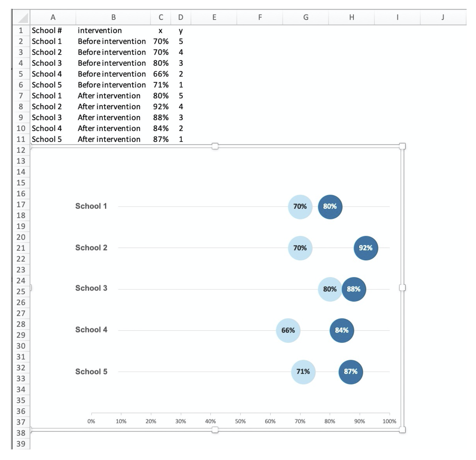
Let's say you work for a School District and your boss asks you to create a visual display that presents the percentage of 5th-grade students in your district who passed general math in 2019 and 2020. You create the following *beautifully* formatted dot plot in Excel that adheres to data visualization best practices and graphic design principles:
The Model Chart

You send it off to your boss and pat yourself on the back. A job well done. Then your boss pops their head into your office and says, "Wow, that looks great. Let's do the same thing for English/Language Arts!"
You enthusiastically say "Sure!" while groaning internally. That last chart you created, and all the fancy formatting took you half an hour to get just right.
Never fear, you DO NOT need to start over. Just turn your chart into a template. (That way if your boss circles back and decides they want to do the same thing for History, Science, and whatever else they teach fifth-graders these days, you can create it in under a minute.)
HOW TO TURN A CHART INTO A TEMPLATE IN EXCEL
STEP 1: Create the Template
Open the Workbook that contains the model chart you created. Next, right-click on the chart and select "Save as Template…" Make sure to use a template name that is descriptive.

STEP 2: Create the Default Chart
Set up the data table for your new chart in a new sheet. Make sure to enter the data the same way you did for the "model chart". Then, insert the *default* Excel chart. (Using the example above, I created the dot plot using Excel's built-in scatter chart.)

STEP 3: Apply the Chart Template
Right-click on the new chart, choose "Change Chart Type", "Templates", and then select the name of the template you just created.

Now, all you have to do is insert a new title and Boom. Done. This tip has saved me a ton of time without sacrificing design quality.
Try it for yourself and tell me what you think!