
Beyond the Trend: Storytelling with Scatter Plots

I love scatter plots, really I do. Many see them as stuffy or scientific. To me, scatter plots are a great starting point for data exploration and discussion. In this post, I share three strategies for taking the humble scatter plot to new heights.
TL;DR: Read on if you are looking for more creative ways of presenting data in a scatter plot than this:

Strategy #1: Annotate Intentionally
Annotations like data labels highlight important data points and help your audience see the exact numbers in your chart. With a scatter plot, it can be tempting to annotate EVERY data point:
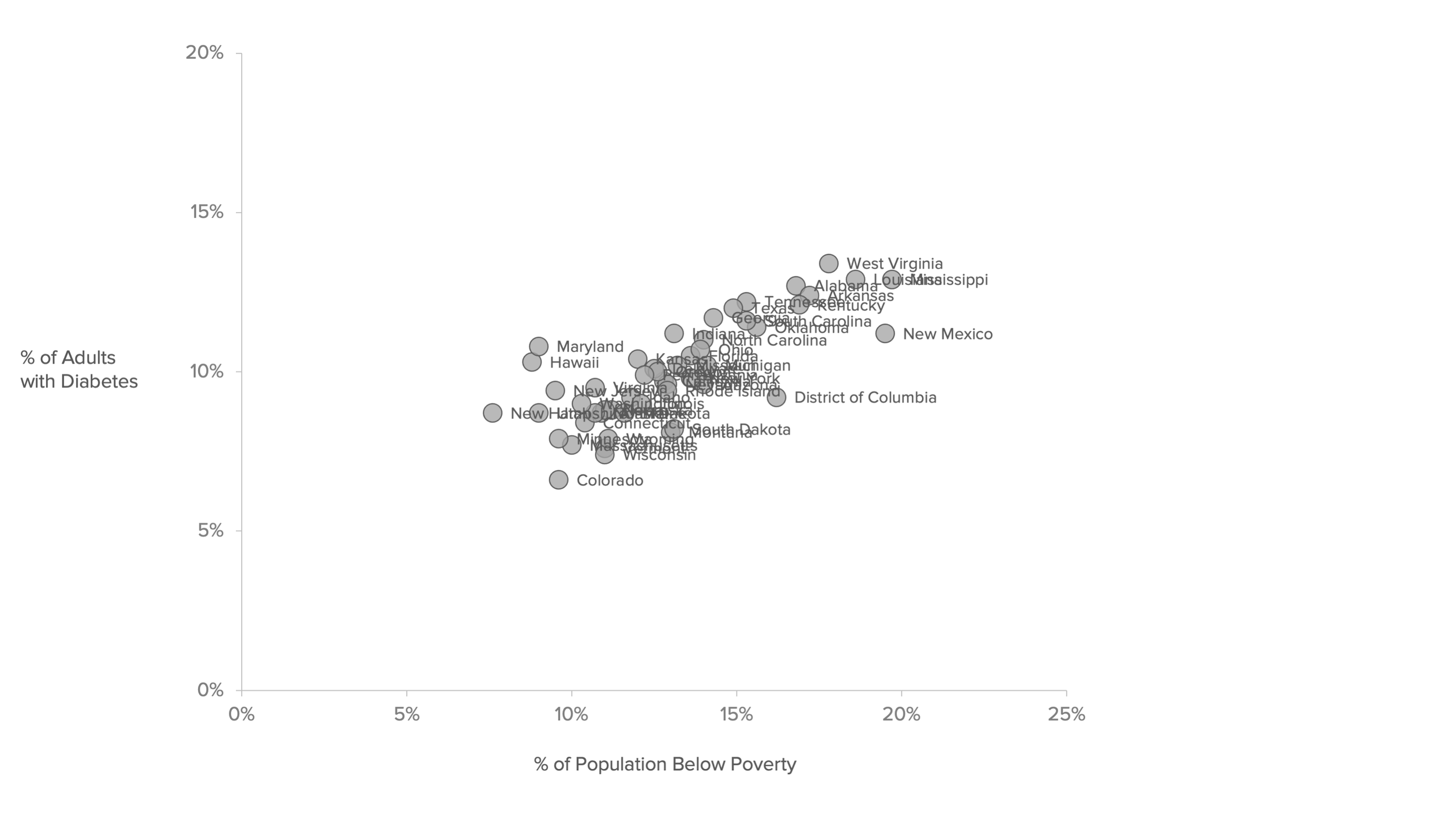
But annotating that many points will lead to information overload and, quite frankly, a clutter-filled mess. One strategy I have learned is to annotate intentionally.
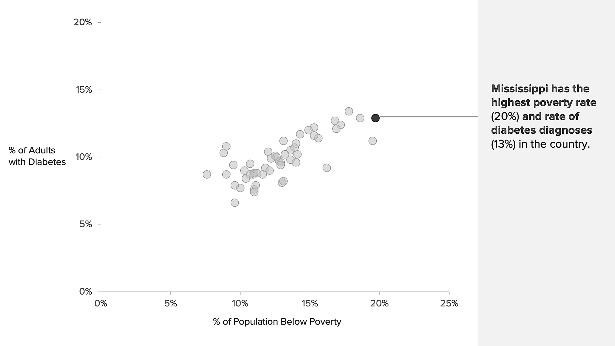
When presenting data in a scatter plot, select several points that may interest your audience and label them. Consider labeling points that deviate from the general trend shown in the graph or have extreme (i.e., low vs. high) values on the variables displayed on the x and y-axis.

Strategy #2: Give Your Audience a Reference
Reference lines are straight (horizontal or vertical) lines that highlight important values on your chart. Unlike data labels, they help show your audience how the data in a chart compare to some significant reference value (like a mean). On a scatter plot, reference lines help your audience understand where data points on the graph lay in relation to the line. Although many designers opt to use a line, I love using reference bands. Reference bands shade an area between two points say the lowest and highest values for the variable displayed along the x-axis. The reference band below gives the audience a sense of the number of states in the dataset with a poverty rate at or below 11.8%.

This reference band gives readers a sense of the number of states in the data set where the prevalence of diagnosed diabetes among adults is at or below 9%.

Strategy #3: Carefully Use Color (and Contrast)
Thus far, all the graphs I have shared are in grayscale. (Yes, I did this to make a point.) Color, when used carefully, can help you clarify important information and enhance your presentation. However, do not rely solely on color to convey your chart's meaning. There should be adequate contrast between elements of your display. (You can use tools like Color Oracle to simulate what your design might look like to people with diverging color vision abilities.) That way, your chart is color accessible to all readers, regardless if it is presented in grayscale:
or color:

Putting it all together
When the strategies are put into practice, your scatter plot can go from this:

to this:

So next time your boss asks you to present data in a scatter plot, think about how you can spruce up your design by:
Annotating (several points) Intentionally
Giving your audience a reference using a shaded band or line
Carefully Using Color (and Contrast) to clarify important information