
Making Meaning, Without the Mental Gymnastics

A couple of months ago, I was perusing the College Board’s website, and I came across the following chart:

The figure displays (in percentages) the educational attainment of adults (aged 25 - 34) between 1940 and 2009.
While (horizontal) stacked bar charts are useful for illustrating and comparing parts of a whole, they are not effective when you have multiple categories of data being displayed across time. I would argue that the (horizontal) stacked bar chart (presented above) contains far too much information to process in a meaningful way.
In this post, I will share two redesign alternatives that clearly (and quickly) convey the key points the authors wanted to communicate:
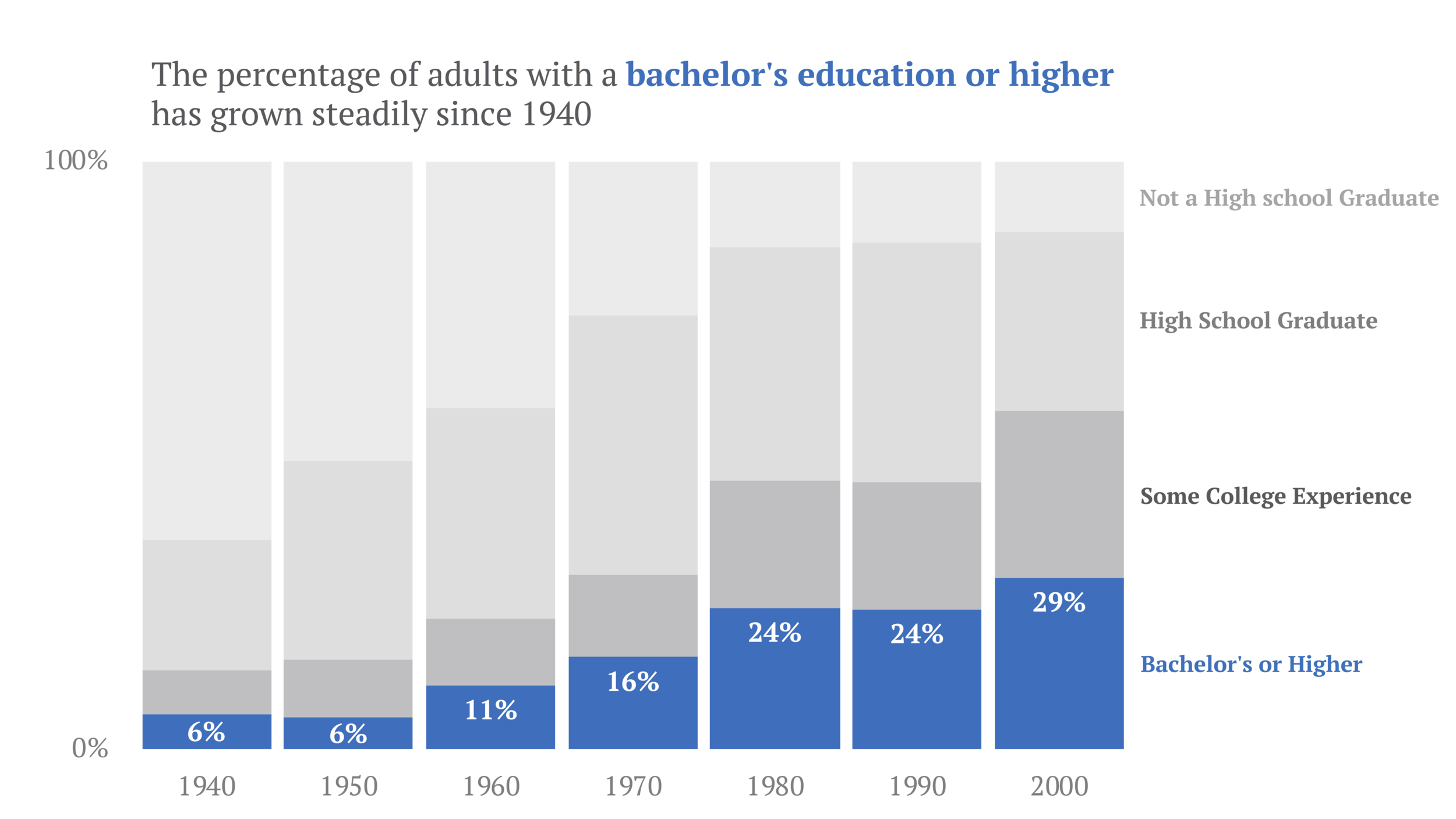
The % of young adults with a 4-year college degree or higher has grown steadily since 1940; and
The % of adults who have some college experience grew rapidly during the 1970s and 1990s.
Redesign #1: A Vertical Stacked Bar Chart + Color for Emphasis
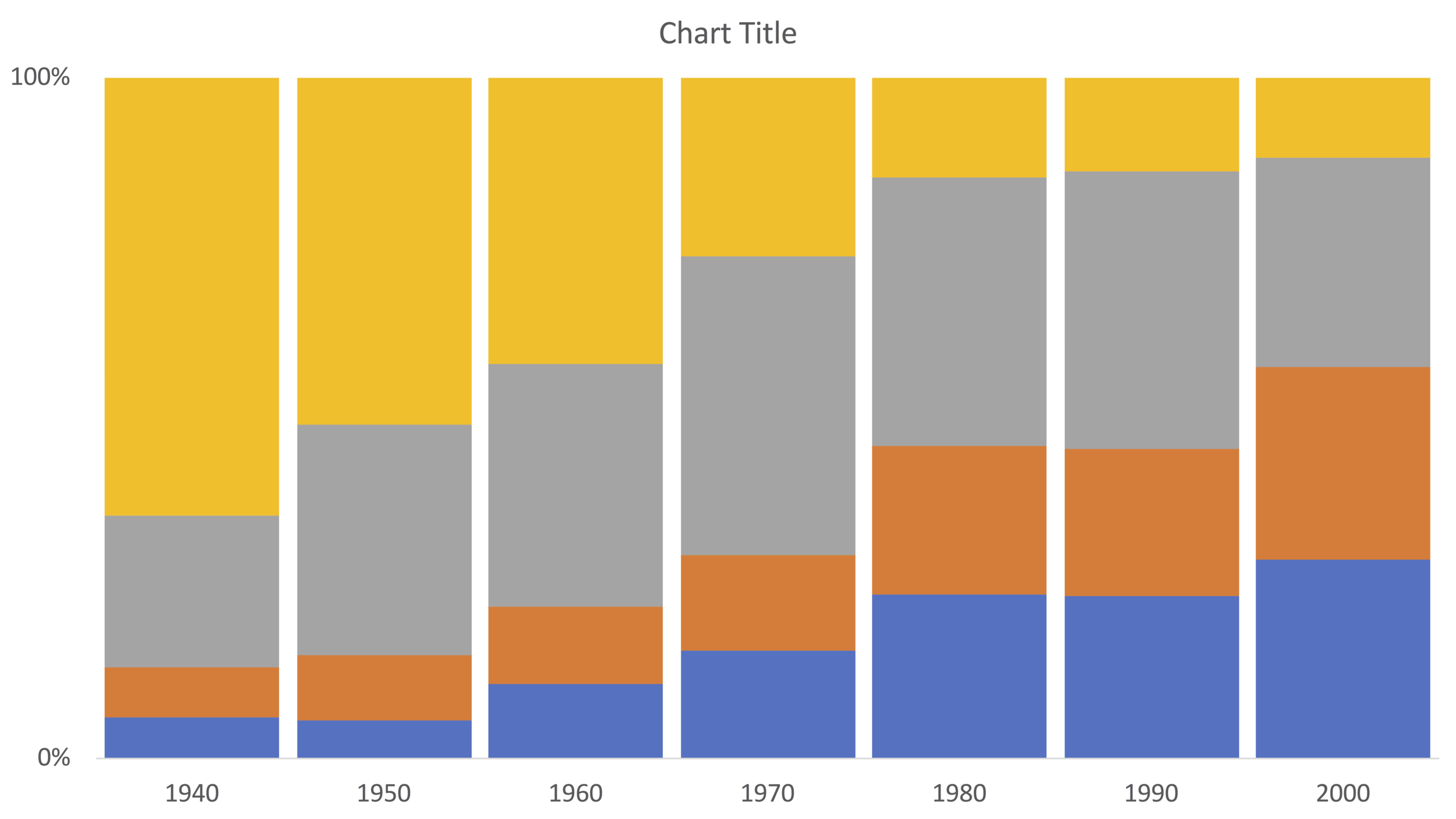
At the very least, I would rearrange the axes, so that percentages are shown along the vertical axis and time is depicted along the horizontal axis. This requires switching from a horizontal stacked bar chart to a vertical stacked bar chart. (In Excel, a 100% vertical stacked bar chart is called a 2D stacked column chart.) The default stacked column chart Excel creates using the College Board data is shown below:

While changing the chart type and rearranging the axes allows for easier comparisons, the graph still lacks a clear message. Moreover, when visualizing data across time, it is a general rule of thumb that the data points being compared must be evenly spaced (in time). Indeed, educational attainment levels are available between 1940 and 2000 in ten-year increments. 2009, however, is the odd year out. Simply exclude data for 2009.
Next, ask yourself: what do I want to convey? Given that there are four series in the chart, it would be wise to focus the audience on a single category. This is where color becomes useful. Color is a powerful tool for highlighting and labeling specific graphic elements and can aid in communicating a message.
For these data, I decided to hone in on the first key point:
The % of young adults with a 4-year college degree or higher has grown steadily since 1940.
To emphasize growth in bachelor’s (or higher) degree attainment, transpose the original data table so that each row represents the % of adults who had attained:
less than a high school degree;
a high school degree;
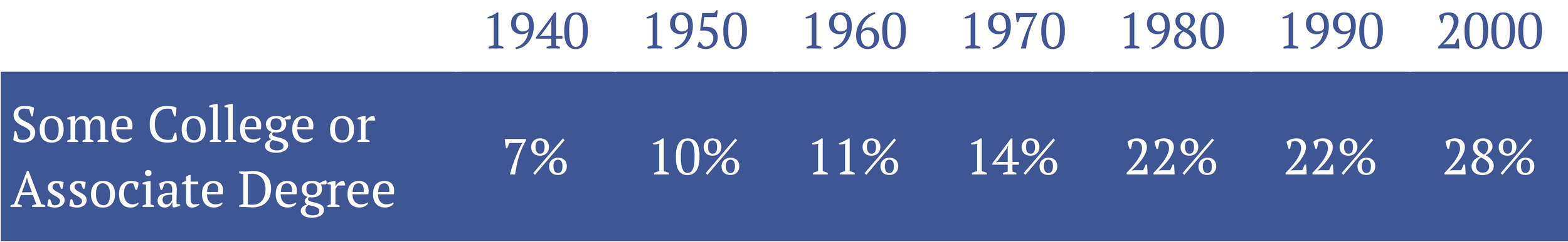
some college or an associate degree; and
a bachelor’s degree or higher;
while table columns show the years for which data are available (i.e., 1940, 1950, 1960, 1970, 1980, 1990, and 2000):

Table showing the percentage of individuals who 1) are not a high school graduate; 2) are a high school graduate; 3) completed some college or an associate degree; or 4) completed a bachelor’s or higher in the United States for the years 1940 to 2000.
The data in the table (presented above) produce the following default 2D stacked column chart in Excel:

Next, set the vertical axis minimum and maximum to 0 and 1, respectively, and the major unit of the vertical axis to 1. Remove the chart legend, change the color of the horizontal and vertical axis lines to white, and set the width of the gap between bars to 10%. (If you are unsure how to adjust a bar chart's spacing, check out Ann K. Emery's tutorial here.)
Finally, add an informative title, apply a unique color to the series you want to highlight, and add data labels to the "Inside End" of the "bachelor’s or higher" series. (Ann K. Emery has a great tutorial on how to add data labels to a chart in Excel.) I also decided to apply a gradient of grey colors to the other three series depicted in the chart along with a label for each of the four educational attainment levels.
The final result (after a little font formatting):
Redesign #2: An Annotated Line Graph
The final redesign will focus on highlighting the second key point using a line graph:
The % of adults who have some college experience grew rapidly during the 1970s and 1990s
Here, we are only interested in visualizing trends among the % of adults who have some college experience:
The data in the table (shown above) produce the following default (2D) line chart in Excel:

First, remove the chart border. Then lighten the primary vertical (axis) gridlines, add horizontal gridlines in the same color (hex #F2F2F2; R: 242, G: 242, B:242), and adjust the horizontal axis position to "On Tick Marks." Then, set the vertical axis minimum and maximum to 0 and 0.5, respectively, and the major unit of the vertical axis to 0.1.

Next, set the width of the line to 1.5pt and add labels and circle markers to the 1940, 1970, 1980, 1990, and 2000 data points. (Jonathan Schwabish and Ann K. Emery have great tutorials on how to annotate a line graph in Excel.)

Then, to emphasize the rapid growth in the share of adults with some college experience during the 1970s and 1990s, increase the width of the line between the 1970 - 1980 and 1990 - 2000 data points to 4.5pt and apply a different shade of blue to the line connecting the points. Doing so will draw the audience’s attention to these segments of the line graph
Finally, add an informative title and apply a pale grey color to the horizontal and vertical axis lines.
The final result (after a little font formatting):

For a chart to be effective, it must convey a specific message. It is up to the designer of the visual, however, to highlight the relevant information and craft a compelling story around the data.