
'Animating' the Line Graph
Over the past six months, I took a hiatus from blogging to complete my dissertation proposal. My dissertation project draws on postcolonial and cultural theory to examine whether Black and Latinx children’s responses to items on a standardized reading assessment depend on the number of generations the child’s family has resided within the United States (US). While my proposal is officially completed (for now anyway), I now have the laborious task of putting together a PowerPoint presentation that will effectively communicate what my project is trying to accomplish. I am not what you would call an experienced presenter, but I enjoy a good PowerPoint presentation as much as the next person. That said, one of the things I struggle with when giving a presentation is keeping people engaged. And throughout my PowerPoint proposal building process, I have found myself thinking through some creative ways of using visual imagery/animation to both engage the audience and demonstrate the significance of my work.
The main reason I chose to focus on Black and Latinx children in my dissertation is that since 1960 Black and Latinx immigrant communities in the US have experienced unprecedented growth. Given this context, I knew that I wanted to include at least one line graph illustrating how the demography of US immigration has changed over time. Lucky for me, the Migration Policy Institute has gathered data on immigrant communities in the US as far back as 1960 (data in Excel format). After crunching some numbers, I was able to use their data to create a worksheet that contained four columns: (1) years for which data are available (i.e., 1960 – 2010 in ten year increments); (2) the total number of immigrants in the US between 1960 – 2010 from all regions of the world; (3) the total number of immigrants in the US between 1960 – 2010 from Latin America (including the Caribbean); and (4) the total number of immigrants in the US between 1960 – 2010 from sub-Saharan Africa (see below).

For ease of interpretation, I decided to add columns three and four together, and transform the raw numbers into a percentage by dividing the resulting sum by column 1. (This percentage represents the proportion of immigrants from Latin America and Sub-Saharan Africa in the US between 1960 – 2010.) To obtain information on the percentage of immigrants from other regions of the world, I subtracted the percentage of immigrants from Latin America and Sub-Saharan Africa from 100. Finally, I deleted columns 2 – 4 so that my worksheet only contained three columns: (1) years for which data are available (i.e., 1960 – 2010 in ten-year increments); (2) % of Immigrants from Latin America & Sub-Saharan Africa; and (3) % of Immigrants from Europe, Asia, Oceania, & North Africa (see below).

Next, I turned to plot the data.
Attempt #1: The (Plain) Line Graph
To build a simple line graph, I first created a scatter with straight lines chart in Excel.

Next, I formatted the chart axes so that: (1) percentages were displayed (with zero decimal places) on the vertical axis; and (2) the number of years displayed on the horizontal axis did not surpass the number of years for which data were available. I also went ahead removed the gridlines and customized the chart’s color palette so that it matched the overall design of my presentation.
The result:

Not too bad, but the graph really did not make a statement. Also, I found that the vertical axis was too cluttered while the lack of data labels made the graph hard to read.
Back to the drawing board.
Attempt #2: The Labeled Line Graph à la Ann K. Emery
I took some time to think about what I wanted to convey with this graph. In the end, I realized that I wanted the audience to pay particular attention to the change in the proportion of immigrants in the US from Latin America & Sub-Saharan Africa vs. Other regions of the word between 1960 and 2010. Now, I’m a girl who does not believe in re-inventing the wheel when it comes to creating data visualizations. Ann K. Emery and Stephanie Evergreen are my go-to data viz gurus when I need inspiration. Ann wrote a blog post a while back on labeling line graphs. Taking a nod from her post, I made a list of the core graph elements I needed to keep, change, or add to ensure that a main takeaway message from my graph is that: Since 1960, the proportion of immigrants from Latin America and sub-Saharan Africa in the US has risen rapidly.
Check out my handwritten list below:
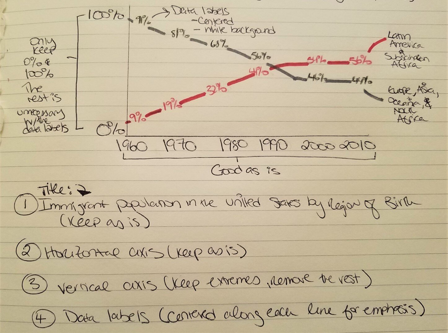
Ultimately, I decided to do the following:
Title: Keep as is. (It’s short and to the point.)
Horizontal axis: Keep as is.
Vertical Axis: Keep the extreme values (i.e., 0% and 100%) but remove the rest.
Data Labels: Add them. I want the audience to see the exact percentages.
The result:

Much better. The vertical axis is less cluttered, and, with the addition of the data labels, the graph is more informative. But since my graph will be viewed by a live audience, I thought it would be more effective if it were animated.
Attempt #3: ‘Animating’ the Labeled Line Graph
To create my ‘animation’, I first built the final graph I wanted to display in Excel, and then made two copies of it.

In the first copy, only data for the years between 1960 and 1990 were displayed:

In the final copy, only data for the years between 1960 and 1970 were displayed:
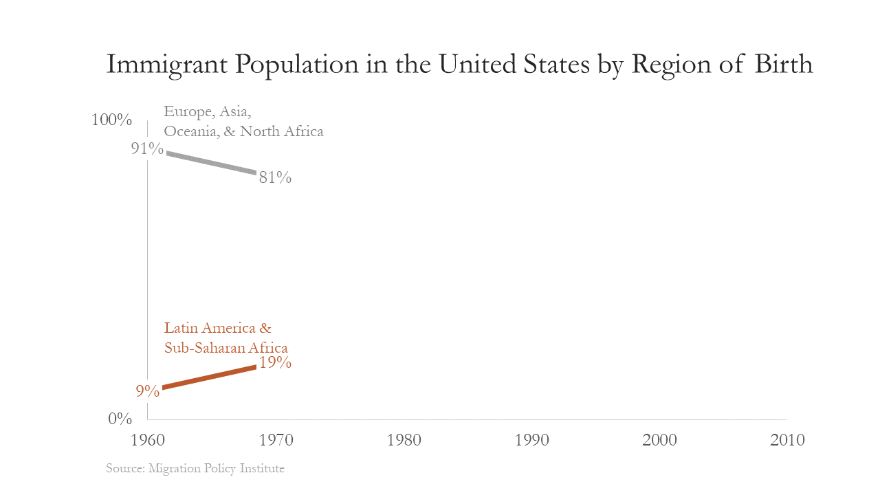
Next, I copied and pasted the graphs onto separate slides in a PowerPoint presentation so that when you scrolled through the slides you could see the change in immigration patterns over time. During this step, I also made sure that the graphs were formatted to the same size and occupied the same position on each slide.

Now, when I give my presentation, I can move through the slides and the audience can visually grasp how the demography of US immigration has changed over time. Moreover, using this approach is sure to leave a more lasting impact than the simple line graph.
TIP: If you want to create a movie of your animation that you can embed in your presentation, PowerPoint has a nifty little feature where you can save your slides as a video.

Be sure to adjust your slide transition settings before you save your animation. (These settings control the timing and speed with which slides change.)
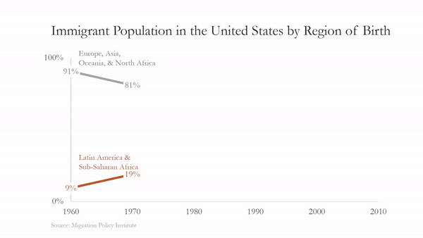
**UPDATE**
I defended my dissertation late last year (woot woot!) and I decided to tweak my 'animated' slides ever so slightly: I moved the category labels to the right side of the graph and added a more informative title. Now the graph looks more balanced.
How would you animate a line graph?